Cards pair an image with text and work well for featuring programs, services, or announcements on homepages and landing pages. By default, cards sit inside the page's padding like any other column in a Blade. Full bleed stretches them across the entire row, and Equal height keeps every card in a row the same height. Need instructions on how to use these? Check out the User Guide page.
Full Width Cards
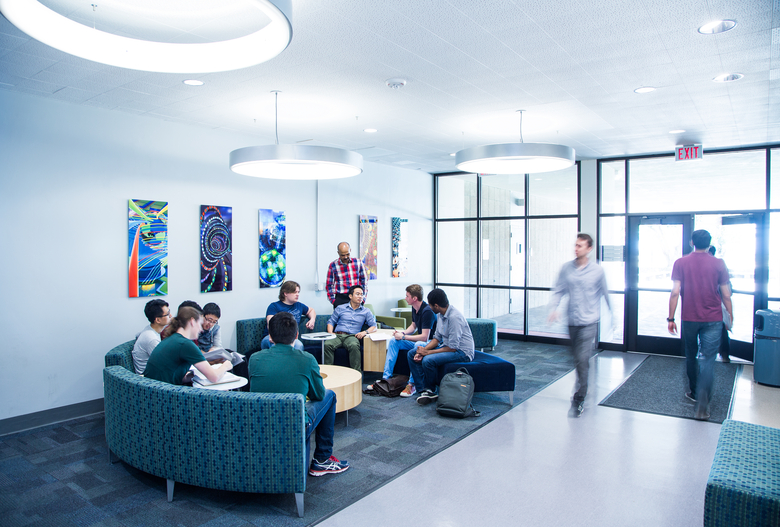
A card at width 12 fills the whole row and places the image beside the text, which makes it a good way to feature one program or announcement. By default it sits inside the page's padding. Turn on Full bleed in the Blade to stretch it from one edge of the page to the other.

Card Combinations
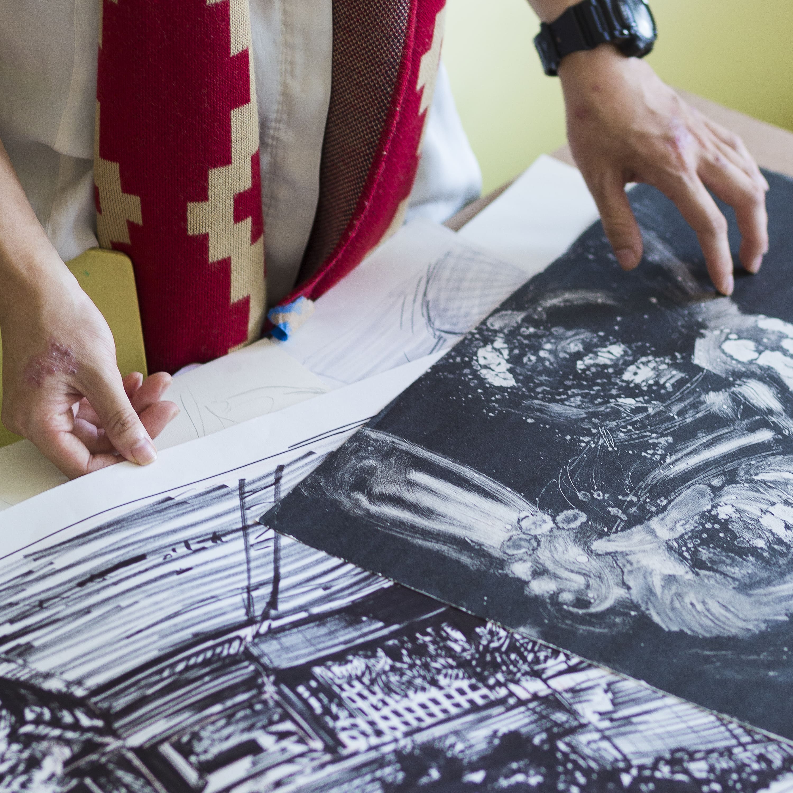
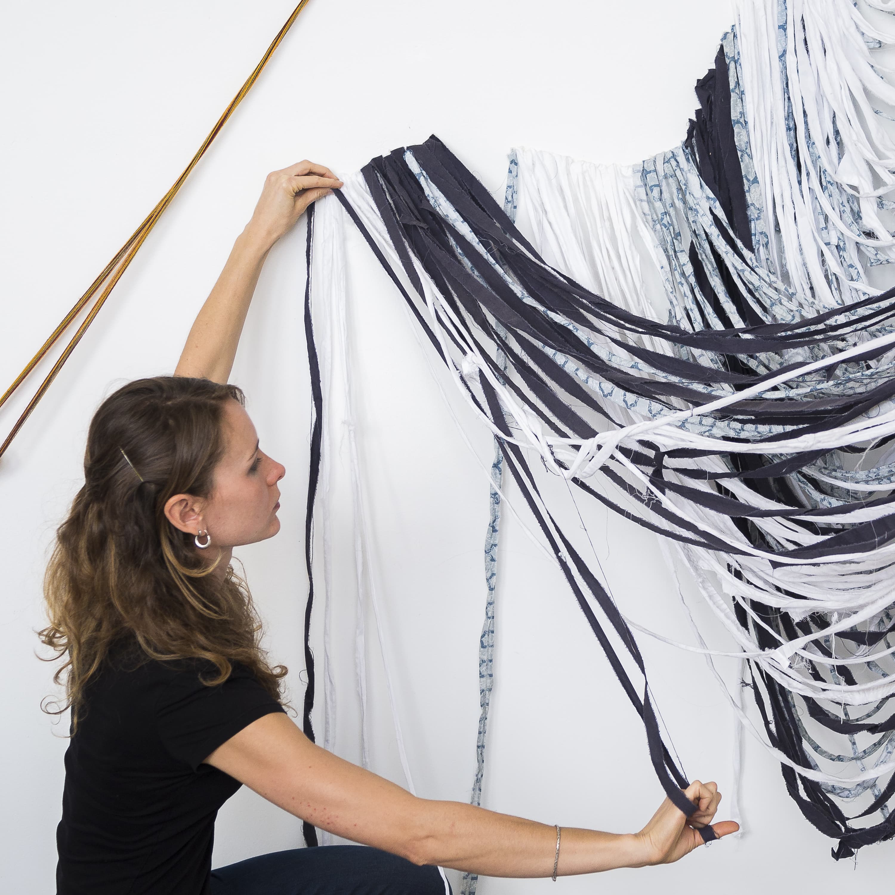
A single Blade can hold as many cards as you need. For even rows, use two cards at width 6, three at width 4, or four at width 3. You can also pair a wide card with a narrow one, such as 8 and 4. When the widths in a Blade add up to more than 12, the extra cards wrap onto a new row, so one Blade can build several rows at once.




Text Only Cards
The image is optional, so a card can be just a background color and text. Text only cards work well for short calls to action or quick links. Pair them with Full bleed to join the colors into one solid band.